Brains and Braun

Originally posted February 5, 2009

Good design for us means as little design as possible. Not for reasons of economy or convenience. It is surely one of the most difficult tasks to arrive at a really convincing, harmonious form by employing simple means…More complicated, unnecessary forms are nothing more than designers’ escapades, which have the function of self-expression instead of expressing product functions…The economy of Braun design is a rejection of this type of design; it leaves away everything superfluous to emphasize that which is more important. 

Dieter Rams

image

Few design companies have enjoyed the amount of critical and commercial success that Braun has for the past half century. Founded in 1921 by the engineer Max Braun, the company vaulted to prominence when his sons Artur and Erwin took the helm in 1951. Artur Braun, in particular, recognized the market potential for progressive design thinking in the burgeoning post-war field of consumer electronics. Part entrepreneur, part design auter, Artur turned to the fledgling Ulm School and its rationalist design principles for input. He hired Dieter Rams in 1954, and surrounded him with other Ulm alumni, including Hans Gugelot, Fritz Eichler, Gerd Muller, and Weinhold Reiss. The collaboration proved fruitful, and the Braun product line expanded from radios and hi-fi equipment to electric shavers, fans, hair-dryers, blenders, and televisions. By the end of the 1950’s, Braun had become the avatar of a fresh and clean-looking visual aesthetic that helped transform the design landscape.

image

The driving force behind Braun design was Dieter Rams. Rams was officially appointed design director in 1962, and he remained in this position until he retired in 1995. Rams’ design philosophy was, literally, simple, and was described by his colleague Rudolf Schonwandt as “order rather than confusion, quiet rather than loud, unobtrusive rather than exciting, sparse rather than profuse, and well-balanced rather than exalted.” In his own writing and speeches, Rams indicated strong opposition to extreme visual stimuli and stylistic obsolescence. He abhorred the chaos he perceived in the visual environment, a chaos stemming from too many designs that called attention to themselves, and too much turnover for mere novelty. Rams attempted to counter this with designs that “integrate better and more pleasantly into people’s surroundings.” Long usage would make these products even more familiar and comfortable.

image

Rams did not turn a blind eye to appearance, but he sought a timeless                           rather than a modish beauty, and clearly favored a minimalist visual aesthetic. His mantra of “less, but better” was not a devaluation of the role of design, but rather a reassessment. As the quote at the top suggests, the design process at Braun was intensive and meticulous, concerned with proportions to the last millimeter, and with details to the last screw fastener.

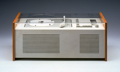
Two products, both illustrated here, exemplify the sea-change in design that took place in the mid-century: the SK-2 radio of 1955 and the SK-4 phono/radio of 1956, also known as “Snow-white’s coffin.” The SK-2, designed by Artur Braun and Fritz Eichler, is to my eye one of the most beautiful and abiding examples of product design from the 20th century. Transistor technology permitted a reduction in scale and the metal case permitted a reduction in material to a maximum thinness. The simple but brilliant decision to extend the speaker perforations across the entire face turned a functional element into a unifying graphic element, one that moreover expresses the underlying aural nature of the product.

image

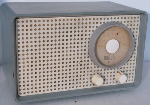
Function is self-explanatory, organized logically and legibly into on/off, volume, and station. The SK-4, designed by Dieter Rams and Hans Gugelot, similarly exposes and conveys its function, showing operating elements without disguise or ornamentation. The plastic cover literally conveyed transparency, and quickly became industry-standard.

image

The run at Braun under Rams’ stewardship was remarkable for its continuity and consistency. If evidence of the excellence of Braun’s product designs is needed, it can be gleaned from length of the production runs of Braun products, how long these products hold up in usage, the number of Braun designs in the permanent design collections of museums such as MoMA, and the demand for vintage Braun designs among design collectors today.

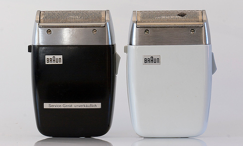
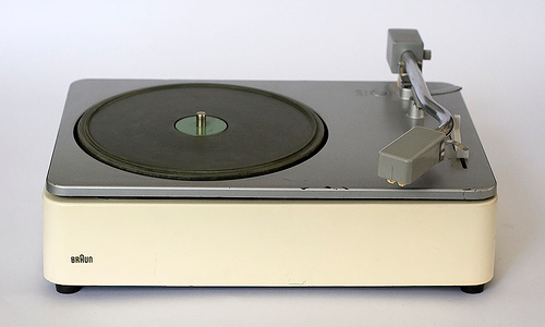
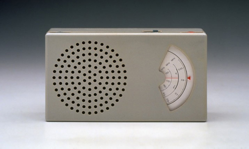
Images from top: Electric shavers, SM-3. Gerd Muller, 1960. Photo from Flickr; Photonium. Record player PS 45. Dieter Rams, 1962. Photo from Flickr; Photonium. Pocket radio T-41.  Dieter Rams, 1959. Photo from Flickr; Marcos Dupico. SK-2 radio. Artur Braun and Fritz Eichler, 1955. Photo by LPW 2. SK-4 phono-super. Dieter Rams and Hans Gugelot, 1956. Photo from Flickr.

‘Mon Oncle’

Originally posted October 23, 2008 on interiordesign.net

image

I watched Jacques Tati’s “Mon Oncle” (1958) the other night. Focusing on the furniture, I came to realize a few things about the film: Yes, it is a satiric send-up of modern technology and culture, a parable that opposes a modern world at once sleek, antiseptically clean, automated, superficial, and inhospitable with a traditional milieu that is spontaneous and convivial, if messy. And yes, Tati is a  latter day Chaplin (or present-day Lucille Ball?), a French everyman whose bumblings expose the sterility, fatuousness, and pretension of modern machine civilization. But people who live in glass houses shouldn’t throw stones, and at least part of Tati occupies the modernist and strikingly beautiful Villa Arpel.

image

Tati was born in 1907 and came of age during the 1920’s, the heyday of avant-garde modernism, the era in France of Mallet-Stevens and a young Le Corbusier. If you plainly see in “Mon Oncle” Tati’s nostalgia for a traditional, older world (which, incidentally, was not about to disappear soon in 1950’s France), you also see the formative artistic pull of modernism. The Villa Arpel reflects a sensibility weened on Le Corbusier—it is an iteration of the “machine for living in,” with its technical gadgets, its decorative asperity, and its conspicuous lack of comfort.

image

But even in the 1920’s, the machine for living in was more a polemical construct than an actuality. By 1956, no one near the mainstream was seriously advocating living in a machine, nor was minimalism apropos to a decade of rampant consumerism. The Villa Arpel was hence an easy target for satire—a clay pigeon, really—and an idiosyncratic vehicle for a parable.

image

It was also an expression of Tati’s own artistic temperament. Tati was a mime with a mime’s economy of motion, gesture, and obviously, words. Minimalism is integral to this art form, and naturally extends to set design. It is not surprising, then, that the Villa Arpel is minimalist (“this is the vase”). What is surprising is how far beyond caricature Tati ventures. The Villa Arpel sets are brilliantly edited and meticulously executed, from the selection of furnishings, which include works by designers such as Baltensweiler, Chambost, Mategot, and Motte, to the spare and elegant arrangements of the pieces, to the vivid accents of color visible in the furniture and clothing, to the outdoor landscaping. The vistas are visually exciting and photographically beautiful. Tati needed only to construct a target for his arrows; instead, he created a tour-de-force of mid-century modernism that looks as fresh today as it did fifty years ago, and still resonates as an abstract work of art.  In its day, the Villa Arpel was copied by a fan as a residence; more recently, it has been the subject of museum exhibitions tracking Tati’s influence on modern design. In the end, the Villa Arpel was rendered with such aplomb and virtuosity, it was so clearly inspired, that it documents the undeniable joy, delight, and creative exuberance unleashed by avant-garde modernism, and this complicates the message of the film, or perhaps makes it a greater work of art.

image

Nowhere is Tati’s ambivalence toward modernism more apparent than with the furniture he designed (along with Jacques Lagrange, his longtime set designer) for the Villa Arpel.  The three key pieces—the “Haricot” sofa (shaped like a bean), the rocking chair with the yellow seat, and the “Harper” sofa (think two tootsie rolls connected by a folded paper clip)—are designed to convey discomfort. At this they succeed, but again Tati goes further than needed.  The rocking chair has a long seat and short back, forcing M.  Arpel to slouch when seated, but this element creates an asymmetry that is visually exciting.  The Haricot sofa looks impossible to lounge upon, and Hulot is forced to turn it on its side to sleep on it.  Try this, though, and you will understand how much effort went into the design, which referenced both Perriand and Kiesler (the 1942 Peggy Guggenheim installation).The Harper sofa is shown with a woman perched rigidly on it, but it is the most beautiful of Tati’s designs—and one of the most striking sofas of the fifties—bridging the precision of the machine age and the sculptural presence of the mid-century (Lescaze meets Noguchi).  One could even argue that these pieces rate highly as good design; they are visually excellent and suited to purpose, given that their purpose is to look uncomfortable.  As a testament to their enduring appeal, all three designs were recently issued by Domeau & Peres in an edition of eight. Ironically, Tati anticipated not only the minimalism of the 1960’s but the limited-edition, not-for-comfort design/art of the present decade.

image

Gorgeous George: George Hunzinger Furniture

Originally posted December 18, 2008 on interiordesign.net

image

Top photo courtesy of:   http://rarevictorian.com/george-hunzinger-1869-patent-sidechair

That George Hunzinger (1835-98) is not a household name like Michael Thonet or even Charles Eames, owes as much to the vagaries of fashion as to any shortcomings on Hunzinger’s part. A German immigrant from a family of cabinet-makers, Hunzinger was a Victorian-era inventor (he held 21 patents) and designer whose commercially successful body of work embraced machine production methods and materials. Regarded by historians and critics as a proto-modernist, Hunzinger was the subject of a retrospective exhibition “The Furniture of George Hunzinger: Invention and Innovation in Nineteenth-Century America” held at the Brooklyn Museum in 1997. In a review of this exhibition, Roberta Smith of the New York Times lauded Hunzinger’s most innovative and forward-looking chairs for their transparency and structural rigor, and for offering an early glimmer of modernism’s emphasis on abstraction and visual austerity. The exhibition, she wrote, “showed furniture shedding its Victorian padding like a butterfly emerging from its chrysalis.”

image

Despite praise like this from a high priestess of design criticism, Hunzinger’s work continues to languish in the market–examples of his work sell for as little as a few hundred dollars on e-bay–and his name remains relatively obscure even in design circles. Surely, much of this is due to modernism’s aversion to things Victorian, and to Hunzinger’s own entrepreneurial savvy, which resulted in a large number of utterly conventional Hunzinger designs–clunky and overly-decorated, they are rightly consigned to the dustbin of history. Even many of Hunzinger’s progressive designs do not escape the trappings of historicism and revivalism, and so look to us more like caterpillars than butterflies. It takes a closer examination to detect the underlying modernity. Left are a handful of stripped-down designs that feature Hunzinger innovations such as cantilevered frames and wire-mesh seats and backs, along with machine-inspired, lathe-turned decorative elements. Spare and abstractly beautiful, these designs rise above Victorian meretriciousness and clutter like the aforementioned butterfly. I cannot explain why they are not as much a part of the modernist canon–and the modern design market–as Christopher Dresser’s metalwork, E.L. Godwin’s Japonesque sideboards, or Michael Thonet’s bentwood chairs. 

image

A look at a few actual Hunzinger pieces should be instructive. The chair with the spiral lathe-turned frame and caramel colored seat looks, at a glance, like a conventional Jacobean-revival design. A second look at the frame–a turn of the screw–reveals that the spiral elements also resemble a drill bit or machine part, and this reveals a deeper dialogue about the role of ornament in a machine age. More forward-looking is the suspended seat and back, which look–and float–like a mid 20th-century design. The armchair with the neo-classical pediment and Ottoman arches contains a mélange of motifs, per Victorian praxis, yet the whole is harmoniously and artfully balanced, and pulled together by the patented wire-mesh seat and back, which gives the work an architectural unity and bearing. This chair not only anticipates Carlo Bugatti’s historicist work of the 1920’s, but with its historical references and wire grid is curiously proto post-modernist, though without the irony or quotation marks.

image

It is fitting to end with a look at the two most stripped-down chair designs, which appear the most modern to our eyes. Both of these chairs have the wire-mesh seat Hunzinger innovated in the 1870’s. This feature in one stroke eliminated the clutter and heaviness of the spring-batting-and-draped fabric typical of Victorian upholstered furniture, and did so using materials and methods suitable to the machine. This experiment with wire mesh pre-figured the wire-mesh chair designs of Bertoia and Eames in 1951. Both chairs also have cantilevered seats and transparent structure. Both have reticulated turned elements that resemble bamboo, a Japanese inspiration. The chair with the asymmetrical back is particularly Japonesque, locating Hunzinger in a vanguard with Dresser, Godwin, and Frank Lloyd Wright  in recognizing and incorporating this powerful modernist influence.

image