The Lives They Lived: Fran Hosken

Originally posted December 30, 2008 on interiordesign.net

To be a designer in mid-century America was to be part of a club of like-minded individuals, widely literate, socially concerned, and avowedly activist. Trained at places like Cranbrook, the New Bauhaus, and the Harvard Graduate School of Design, a young generation of designers shared with their teachers a sense of responsibility and efficacy. Boundaries were fluid, so that furniture or industrial designers also engaged matters of architecture, landscape design, community planning, and urban renewal. As fully-rounded citizens, designers were above all cultural participants, with a level of commitment and dedication we today can only acknowledge and admire.

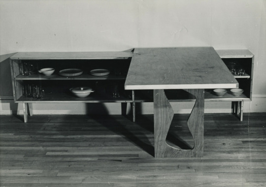
Franziskas Porges Hosken (1918-2006) was born into a prominent Jewish family in Vienna and immigrated to the United States in 1938. She graduated from Smith College in 1940 and moved to Boston to study architecture and design. One of the first female students admitted to the Harvard School of Design, she earned her Masters in Architecture in 1944. At Harvard, Fran learned Bauhaus ideas and methods from Gropius and Breuer, and Kepes and Moholy-Nagy. While a graduate student, she designed and built a flip-down dining set for her own use, a design that would later be featured in a prestigious international design review. Fran began designing furniture for the market in 1947, and along with her husband, James Hosken, founded Hosken, Inc. later that year. One of her first projects, a stacking stool, became a commercial and critical success. More acclaim would follow. Over the next few years, their work was published in Furniture Forum, The Everyday Art Quarterly, Arredimento Moderno, House and Garden, and The New York Times. It was distributed by Knoll, Raymor, and Macy’s, and was shown at the Chicago Merchandise Mart (including a MOMA Good Design selection in 1951) and the Milan Triennale. Despite this promising start, the business foundered in 1951 when Fran had her first child and a deal for a factory space fell through.

Writing about her own career for a retrospective at the Lin-Weinberg Gallery in 2001, Fran noted that “Hosken, Inc. was a good idea; the time was right, but we had no capital and no investors to back us up and too little business experience.” She went on to observe: “Now some 50 years later the very concept of what was called ‘modern’ by a new generation of architects has vanished especially in housing and furniture. The great wave of enthusiasm for ‘new design,’ starting with a new social concept of housing and ‘form follows function’…is gone and has vanished, which I deeply regret. The design and social ideas which I still believe in and which I then thought would sustain the production of simple, demountable, and affordable new furniture…for young families are dead and gone.”

Fortunately for posterity, Fran was anything but a pessimist, and with the closing of one door, many other doors opened. During a long and varied career, Fran defied conventions and forged a path of her own choosing. She was a pioneering architectural photographer and archivist (the bulk of her collection is now at Texas A&M University). She was a journalist and teacher on matters of design and architecture. She published books about urban planning, notably The Language of Cities (1968). She traveled extensively, particularly to Africa and Afghanistan, and gained first-hand knowledge about women’s issues in Third World countries. Not one to be limited in her own options, she became active in feminist causes beginning in the 1970’s, serving on the boards of numerous organizations, and founding WIN, the Women’s International Network, a pre-internet means of connecting women and issues globally. She published and distributed a feminist newsletter out of her own house until well into her eighties. And she took up painting in her fifties, becoming a fairly accomplished artist.

I came to know and admire Fran while planning an exhibition of designs and design prototypes from her own collection. Fran was flattered by the belated attention to this part of her career, but it quickly became apparent that the furniture and jewelry that so interested me was but a footnote to Fran. Fran wrote me in April 2001 that she would try to attend the opening of her exhibition–we were providing transportation and accommodations–if she finished publishing the current edition of WIN NEWS in time. This was humbling to me, but demonstrated Fran’s focus and fierce dedication to issues that mattered to her. As her daughter-in-law eulogized, “She felt that unless you were doing something for the world, you were useless.” With Fran’s passing in 2006, the world of design–and the world at large–lost a passionate and tireless advocate.

Edward Wormley: Pictures from an Exhibition

Originally posted Septermber 3, 2009 on interiordesign.net

I’m finding it hard to believe it’s been 12 years since Lin-Weinberg presented its groundbreaking Wormley exhibition, and published the accompanying catalog, “Edward Wormley: The Other Face of Modernism.” While we could not take credit for discovering Wormley—he had remained on the radar, though his fortunes had slipped—we did help nudge him back toward the center of the modern design map.

Four years later, in the aftermath of 9/11, we revisited Wormley with an installation at Sanford Smith’s Modernism + Art20 show. Here, we attempted to create an interior that would merit Wormley’s approval. The work helped us put one foot in front of another through a very difficult period, and the results seemed to be appreciated by a shell-shocked design community. Here is what I wrote at the time:

“It has been four years since Lin-Weinberg presented [its] retrospective exhibition [on Wormley]. In this period, there has been a resurgence of interest in Wormley’s furniture designs, from icons such as the ‘Listen-to-Me’ chaise to unassuming side tables and benches. And this is justly so. Wormley possessed a keen eye for style and proportion, an ability to work both with fine materials and industrial techniques, and a commitment to comfort and flexibility. His best designs rank with the best designs of the period, either for usefulness and economic value, or for sheer exuberance and imagination.

Yet, Wormley’s rediscovered stature as a furniture designer should not obscure his talent and significance as an interior designer. From 1944 on, Wormley kept an office in New York City from which he took on residential commission work. He also designed the interiors for Dunbar showrooms, installations, and catalog layouts. Critics praised Dunbar showrooms for their aplomb and virtuosity, for adaptability, unerring taste, and sound, unpretentious good sense. A Wormley interior incorporated a broad range of influences, ranging freely across geography and time, drawing inspiration from East and West, past and present. Finishing touches included Moroccan rugs,  modern paintings, and African sculpture.  Wormley once called himself a middle ground designer, and indeed his work occupies an interior middle landscape, mediating between the agenda of the International Style and the often competing claims of tradition and craftsmanship. Wormley’s brand of modernism allowed for familiarity, memory, and personality. His interiors were templates for self-expression, balancing accent pieces for drama and excitement with an underlying architectural sensibility that favored clean lines and simple elegance.

More than as a designer of individual pieces of furniture, Wormley should be remembered for the living spaces he created. As an interior designer, Wormley anticipated a multitude of needs and built interiors “for the comfort, dignity, and sense of security of human beings.” (John Anderson, Playboy, 1961) Wormley’s aesthetic vision reached its fullest expression in his interiors. His was an art of assemblage, of juxtaposition and composition, whether of elements within a piece or of pieces within a setting. Our installation seeks to showcase Wormley’s ability to blend old and new, luxurious and simple, into a practical, harmonious, and dynamic modernist interior.”

Today, Wormley is recognized as the modern American master he was. His pieces sell at top galleries and auction houses, and are placed into projects by leading interior designers. Dunbar has even been revived, and is reproducing some of Wormley’s designs. Last year, Todd Merrill included a chapter on Wormley in his survey of American studio furniture, “Modern Americana: Studio Furniture from High Craft to High Glam.” And few people are asking, as they were at the exhibition opening in 1997, “Who is Wormley?”

Wingate Paine

Originally posted December 11, 2008 on interiordesign.net

My first exposure to the photography of Wingate Paine occurred about 10 years ago when a portfolio of his work turned up in a gallery on Lafayette Street in Manhattan. As I sifted through hundreds of unframed images, I learned that the then-obscure Paine had been a leading fashion and advertising photographer in the early 1960’s who quit that scene to do a homage to womanhood. The work I was looking at was erotically charged and cinematic: think Mad Men meets Blow-Up.

What caught my attention was the mood—the images channeled Mary Quant’s London, though Paine was as American as Ansel Adams. Of course, it didn’t hurt that the women were stunningly beautiful, and often more naked than not.

Paine himself had an unusual and varied career trajectory. Born in 1915 into a Boston Brahmin family—namesake of a Founding Father—he eschewed his hereditary connections in banking and law to become first a Marine captain, then by turns a yoga devotee, wine connoisseur, photographer, filmmaker, and later a sculptor and Buddhist teacher and writer. After a long period of neglect, Paine’s stock has been rising in recent years. His work has been turning up at auctions such as Swann’s, Wright, and Rago, and has been shown in galleries in New York and Los Angeles. Tonight, the first solo exhibition of his photographs opens at the Steven Kasher Gallery in New York City.  Running through January 17, the show features over 75 vintage prints from Paine’s personal archive, drawn primarily from his 1966 book Mirror of Venus. Co-written by Francoise Sagan and Federico Fellini, Mirror of Venus has been reprinted 10 times in four languages. Paine’s photographs of three models/muses provide vicarious pleasures, if not titillation. Tame by today’s standards, the book pushed boundaries in its day. Though tinged for us with 60’s nostalgia, the images remain visually fresh, if only because the decade keeps cycling back into fashion. The text, unfortunately, seems dated to our post-feminist sensibilities.

Witness Francoise Sagan: “For a woman the time/is often the time./After the time,/it is sometimes the time;/but before the time, it is never the time.” I know I don’t understand women; I certainly don’t understand Francoise Sagan. At least Fellini is more straightforward: “Why can’t we always live in a house full of women like this(?)” Why indeed.  For an experience that is highly evocative and a bit provocative, try the book, or better yet, see the exhibition.


When Herman Met Rockwell: The Definitive Moby Dick

Originally posted August 6, 2009 on interiordesign.net

image

“Whenever I find myself growing grim about the mouth; whenever it is a damp, drizzly November in my soul; whenever I find myself involuntarily pausing before coffin warehouses, and bringing up the rear of every funeral I meet…then, I account it high time to get to sea as soon as I can.”

image

So begins “Moby Dick”—first paragraph, anyway—the man meets fish (well, aquatic mammal) epic penned by Herman Melville in 1851. Immortal words now, but for a period of time prior to 1920, largely forgotten ones, along, not incidentally, with the words and works of Louis Sullivan and Frank Lloyd Wright. Reassessment and rediscovery began in the early 1920’s, partly through the efforts of critics such as Lewis Mumford (“The Golden Day,” 1926, and “Herman Melville,” 1929), and Carl Van Doren (“The American Novel,” 1921). Interestingly, and again not incidentally, the same wave that brought Melville, Whitman, and Thoreau back into view also re-introduced Richardson, Sullivan, and Wright (Mumford, The Brown Decades, 1931).

image

But the biggest boost to Melville’s reputation came from Rockwell Kent, with the publication in 1930 of the 3-volume Lakeside Press edition of Moby Dick, illustrated and designed by Kent. Both the limited edition (1000 copies) and the Random House trade edition, also published in 1930, sold extremely well, helping push Melville back into the public consciousness. Melville was overdue, no doubt, but this was clearly a Reese’s peanut butter cup moment, a happy marriage of writer and illustrator. Indeed, it would be hard to find a writer-illustrator combination as well-matched, unless maybe it is Hunter Thompson and Ralph Steadman, though Kent and Melville didn’t work together, and surely didn’t party together (Kent was 9 when Melville died in 1891).

image

That Melville and Kent were kindred spirits is evident in their biographies and their paths, which crossed literally and metaphorically. Both men spent significant portions of their lives in and around New York and the mountains north and west of the city. Melville was of the generation of romantic writers and thinkers that included Emerson and Thoreau; he was also a sailor and an adventurer—his first three novels, “Typee,” “Omoo,” and “Mardi,” recount his travels to exotic lands. Kent was weaned on mysticism and transcendentalism, reading Emerson and Whitman extensively (he also illustrated Leaves of Grass). He, too, was an adventurer and fellow traveler (in more ways than one: Kent received the Lenin Peace Prize in 1967). Kent’s early books include “Voyaging Southward from the Strait of Magellan” and “N by E,” recounting sailing adventures to Tierra del Fuego and Greenland. Additionally, Melville’s scathing indictment of commerce and materialism in “The Confidence Man” is echoed in Kent’s embracing of socialism.

image

So when Kent was approached in 1926 with an offer to illustrate Dana’s “Two Years Before the Mast,” he suggested “Moby Dick” instead, and the rest is publishing history.

image

Since 1930, Melville’s—and the book’s—place in the pantheon of literature has remained secure (Starbuck’s, anyone?), while Kent’s artistic reputation has largely waned in the face of abstract expressionism and successive art movements. But the illustrated “Moby Dick” has remained in print for 75 years, thrilling generations of readers with Melville’s incandescent prose and Kent’s dramatic and haunting engravings.

image

llustrations from “Moby Dick” illustrated by Rockwell Kent; courtesy of Plattsburgh State University.

Tin Man: Christopher Dresser’s Work in Humble Metals

Originally posted March 5, 2009 on interiordesign.net

image

Christopher Dresser (1834-1904) cut a wide swath across 19th-century culture and commerce. In a career spanning 50 years, he wrote and lectured about botany and ornament, and produced an array of designs in areas as diverse as furniture, dinnerware, glass, ceramics, silver, textiles, and wallpaper. Hugely successful and influential in his day, he was nonetheless marginalized after his death by a design press that all but lionized William Morris.

image

Reassessment was slow to take place, and focused on the proto-modernist aspects of his work, specifically on the geometric and austere silver designs of the 1870’s and 1880’s. Nicholas Pevsner devoted all of one paragraph to Dresser in his 1936 Pioneers of the Modern Movement, citing a pair of silver cruets for their startling simplicity of form. Herwin Schaefer similarly mentioned Dresser in passing in Nineteeth Century Modern (1970), again focusing solely on the prescient modernity of the silver designs for Hukin & Heath and Dixon & Sons. Only in the past twenty years has a fuller and more balanced picture of Dresser emerged. Notable here are the monographs by Widar Halen (1990) and Stuart Durant (1993), and the 2004 exhibition catalog Shock of the Old: Christopher Dresser’s Design RevolutionThese accounts have in common an attempt to illustrate the range of Dresser’s work, and to relocate Dresser as a Victorian thinker and creator, as much a man of his day as ahead of it.

image

Still, in all these writings the astonishing silver designs take center stage. Executed after his epochal trip to Japan in 1877, the silver and silver-plated teapots, decanters, tureens, and toast racks look to our eyes more like Bauhaus or post-modern objects than like Victorian things. They represent a body of work unrivaled in the 19th century, and still relevant in the 21st century—original examples can fetch in excess of $100,000, and Alessi recently re-issued a series of Dresser’s silver designs in stainless steel. Lost amidst the fanfare for the silver design is Dresser’s work in tin, copper, and brass. 

image

Generally, the designs in these humble metals are treated as poor cousins to the silver designs, and they garner less print and fewer illustrations in the literature. To some extent, this is because less is known about this work, including which designs Dresser himself was responsible for. Still, there is no doubt that in the 1870’s and 80’s Dresser’s office did work in copper and brass for Benham & Froud, and in tin, copper, and brass for Perry & Sons of Wolverhampton. The latter company in particular has attracted my attention, and I have over the years examined 20-25 different Perry & Sons designs that I would attribute to Dresser, and I would guess there are at least as many more still out there. I have collected about a dozen examples, six of which are illustrated here.

image

What unites and identifies Dresser’s work for Perry & Sons is what separates it from most Victorian design—the interplay of geometric forms, the origami-like foldings, the bold use of color, and the lack of superficial ornament. The low cost of the materials, combined with the relative ease of working them, allowed a tangible freedom of expression not present in the silver work. The tin (and brass) candle holders and watering cans convey a sense of delight and exuberance; they are inexpensive but confident works that make a bold and progressive visual statement. I would suggest that the Dresser design team’s tin pieces for Perry were to the late 19th century what the Nelson design team’s clocks for Howard Miller were to the 1950’s—the output of a laboratory for creative experiment and design-play, and a proving ground for new shapes and forms. Yet, before we rip Dresser out of his Victorian milieu, we should point out, as one wag did, that while Dresser was designing forward-looking tin candle holders, Edison was inventing light bulbs.

image