Originally posted November 18, 2010 on interiordesign.net

For Patrick Jouin, ascendant French design star and subject of a solo exhibition at the Museum of Arts and Design (MAD), exposure to the precision, rigor, and poetic potential of the machine came at an early age. His father was a technician and craftsman; in the family basement was a Roger Tallon “Gallic” lathe–a room-sized machine tool designed by France’s pre-eminent modern industrial designer. Jouin cites this circumstance, along with a trip to a Da Vinci exhibition, as formative influences. Da Vinci and Tallon: it would be hard to find two better avatars for a career spent relentlessly sketching and innovating, finding surprising beauty in pushing technical boundaries.

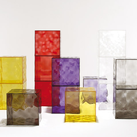
After studying industrial design in Paris, and an apprenticeship with Philippe Starck, Jouin opened his own studio in 1998. Some fifty pieces of product design from the decade-plus since are featured at MAD, in what is Jouin’s first solo show in the U.S. (He has had several elsewhere; most recently at the Pompidou Centre). Included are greatest hits, such as the One-Shot Stool, part of the Solid line of polyurethane pieces produced by 3D rapid prototyping (2004); Optic Furniture Cubes for Kartell (2008); the Alessi Pasta Pot, designed in collaboration with Alain Ducasse (2007); and the Chaud line of ceramic tourines hand-made by Vallauris potters (2002). Also included are current and forthcoming designs such as the Zermatt line of stainless steel cutlery for Puiforcat; the “Bloom” table lamp, also produced by stereolithography, that has a one-piece hinged “bud” that easily opens or blooms; G.H. Mumm’s champagne accessories; and a modular sofa for Bernhardt.

In discussing his work, eloquently, at a presentation last Thursday, Jouin referred repeatedly to simplicity and the role of gesture, obviously two keywords for him. By simple, Jouin means something like direct, honest, and unpretentious; less a matter of egotistic self-expression than a deep meditation on the program and the context. What appears simple or self-evident is the product of a long process of research, engagement with the problem or problems to be solved, technical experimentation, and endless sketching, often done at a favorite café. Beauty is often a byproduct of technical and formal inventiveness bumping into physical and economic constraint.
Gesture, for Jouin, apprehends the context in which design is used, and assigns to design a large social role as non-verbal communication.

Repeatedly, he likens design to dance. In designing the chair for the Jules Verne restaurant at the Eiffel Tower, for example, Jouin imagined a couple on a first date: the ritual or gesture of being seated at the table became an important part of the romance–the visual impression had to be memorable, the chair had to slide easily, so the lady could be seated gracefully, etc. So too with the Chaud turrine–taking the top off and putting it under the bottom saves the waiter a trip–and the Zermatt cutlery, which are curved so that only two points touch the (dirty) tablecloth. This type of attention to detail and usage defines Jouin’s work. His objects embody a rigorous yet graceful and intimate choreography that plays out hundreds of times a day as his products are used.

Jouin is a household name in France, for his product designs, his public commissions, and his architectural and interior work with Sanjit Manku. It is said that one of his designs is encountered in Paris every 340 feet. In New York, we are more fortunate–we can see one of his designs every 3 feet, but only by visiting MAD before February 6.


