midcentury

What’s in a Catalog? George Nakashima, 1962

Originally posted May 6, 2010 on interiordesign.net

“Furniture, we feel, is a development of mood besides being purely utilitarian. Basic forms with the reflection of the constancy of nature find satisfaction in times like ours. A small poetic haven in an unsettled world where excitement seems so necessary.” 

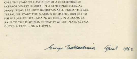
George Nakashima, from his 1962 catalog

The 1962 Nakashima catalog shows the same artistry and meticulous attention to detail as his furniture. Like his tables, chairs, case pieces, and lamps, like his writing, architecture, and his business, it is suffused with his philosophy. Humility, simplicity, serenity, natural beauty, harmony, pride, dedication—all were a way of life to him. The catalog expresses his philosophy in its artful and well executed photographs and uncluttered layout, in the choice of fonts, the use of Japanese hand made wrappers, endpapers, and pages, and hand-sewn binding. It states his philosophy and his approach, succinctly, in its text.

On craftsmanship and modern design:
“In a world where fine manual skills are shunned, we believe in them, not only in the act of producing a better product, but in the sheer joy of doing or becoming. We feel that pride in craftsmanship, of doing as perfect a job as possible, of producing something of beauty even out of nature’s discards, are all homely attributes that can be reconsidered. It might even be a question of regaining one’s own soul when desire and megalomania are rampant…”
“In proportion to the flood of consumer goods, we are probably at one of the lowest ebbs of design excellence the world has seen. It requires a genuine fight to produce one well designed object of relatively permanent value.”

On the idiosyncratic nature of his output:
“Many of our pieces are one-of-a-kind and cannot be reproduced nor accurately shown. They often depend on a particular board with extraordinary characteristics. Such boards are at times studied for years before a decision is made to its use, or a cut made at any point. Distinguishing features are fine figures in graining, burls, rich and deep coloring, unusual profiles, and even areas of decomposition.”

On using solid wood:
“Solid wood is a challenge. It is continually ‘alive’ and ‘moves’ depending on weather conditions, moisture content of the air, and temperature. Each board of each species is individual and must be understood; the good characteristics exploited.”

And, significantly:
“Furniture should be lived with and not considered something overly precious.”

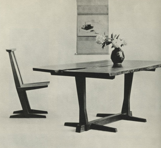
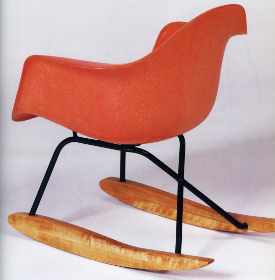
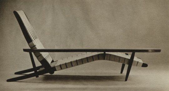
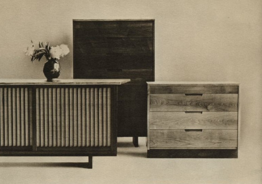
The Nakashima catalog is unlike any other I can think of. Part admonition, part jeremiad, it enjoins or challenges his customers to see things differently and to share with George his deep respect for craft traditions, nature, and the well-springs of creativity. Cost was not a formidable obstacle. The 1962 price list shows a Conoid triple chest with sliding doors selling for $360.00; a seven-foot hanging wall case with free-edge front for $350.00; a floor lamp for $105.00; a 66-inch slab coffee table for $150.00, a double pedestal desk for $225.00, and a New chair with rockers and arm for $125.00. This at a time when a Dunbar chest of similar size cost up to $1,500.00, a Herman Miller desk cost $500.00, and Eames aluminum group armchair cost $195.00. Clearly, on some level, George was at least as interested in getting his message across as turning a profit, or maybe he just enjoyed what he was doing.

The 1962 catalog shows George walking the walk as well as talking the talk; it is a document that embodies and projects what he is about, both in word and act.

Circular Reasoning: On the Geometry of Chairs

Originally posted November 24, 2010 on interiordesign.net

Beginning with de Stijl, geometry became an obvious metaphor for the scientific and mechanistic modes of thinking associated with avant-garde modernism. Mondrian’s canvases, arguably influenced themselves by Frank Lloyd Wright’s Prairie School architecture, became templates for mid-century wall systems and modular case good systems, as well as graphic inspiration for architecture.

All of these applications self-evidently involved rectilinearity or at least linearity–the so-called deconstruction and reconstruction of the box, applied both to surface and volume. Famously, this was the approach taken with Rietveld’s Red and Blue chair, which was explicitly linear, a rigid composition of wooden planks designed with little regard for comfort. Much cantilevered, Bauhaus-inspired furniture would also fit into this camp, though with somewhat greater interest in comfort. In the opposing, organic camp, are chairs such as the Womb chair, ergonomic in character, curvilinear, and fitted to the human form.


The circle occupies a place somewhere in between though much closer to the geometric camp; in Platonic terms, the circle is perfect, the ultimate geometric symbol of wholeness, unity, infinity. With tables, there is a long tradition of circular design: the Knights of the Round Table, round table discussions, etc. (note the underlying egalitarian aspect of this shape–no one sits in a privileged position).

Though curvilinear, the circle does not suggest itself for chair design–people have curves but are not hemispheric or conical, at least generally speaking. A circular or spherical chair is not inherently ergonomic, though it can be rendered comfortable with slings, padding, pillows, or butt-shaped indentations. Partly for this reason, and likely for technical reasons also, relatively few chair designs hewed to the geometry of the circle. And those that did tended to have an agenda: either experiments in form or ideological or symbolic statements of some type.

Beginning in the early 1950’s, the circle was deployed in chair design in the work of Donald Knorr, Lina Bo Bardi, and Roberto Mango. Knorr’s chair, shaped from a ribbon of sheet metal, shared first prize in a 1950 MoMA Low-Cost Furniture competition. Distributed by Knoll, and painted red, yellow, or black, with black metal legs, the chair possessed a minimalist and elegant beauty. Intended to be comfortable, the chair was also offered in a padded version, just in case. Bo Bardi, the Italian/Brazilian architect and designer, contributed an eye-catching chair consisting of a hemispheric seat floating inside a round tubular metal base. The chair could be used parallel to the ground or at an angle, for a variety of seating or lounging positions. The image here, which uncropped shows two such options, is from the cover of an Interiors magazine from the early 1950’s. It is notable, and surely meaningful, that Bo Bardi is a woman designer and the circle is a female archetype. Unlike Knorr and Bo Bardi, the Mango chair illustrated here is made of wood–in this case shaped plywood–and it looks like a James Prestini bowl on legs. This chair is part of a series done by Mango in wood and metal, exploring the possibilities of the circle as a chair frame. Significantly, all the designs referred to here had one thing in common: a lack of commercial success, and hence a small production run.

Continuing this tradition were three circular chair designs from the late 1960’s. In the case of Arman’s 1969 chair for Atelier A, consisting of two steel rings with a leather sling, the intent was not serial production but design/art; more a functional sculpture than a seating solution. Joe Colombo’s 1969 Tube chair for Flexform cleverly used round tubes looking like paint rollers to achieve a variety of seating options. Despite advertisements pointing to the comfort obtainable through the flexibility of assembly, the chair was far too radical for prevalent taste cultures.

Somewhat more accessible, and commercially viable, was the work in plastic by Finnish designer Eero Aarnio. His Pastille chair of 1967, with its contoured seating indentation, took the circle in an ergonomic direction, while his Ball chair of 1969, shown here and based on a sphere, required cushions and pillows to suggest comfort. The Ball chair stood, and stands, as a production analog to the utopian 1960’s preoccupation with self-contained living environments.

While this is not an exhaustive list of post-war circular chair designs, the two clusters around 1950 and 1969 do suggest an underlying cultural rationale at those moments—some metaphoric or symbolic reason for this attraction to the circle.  A topic I will deal with when I get around to it…

Carney on Design

Originally posted September 2, 2010 on interiordesign.net

Clive Carney was an Australian interior designer who took a hiatus in the late 1950’s to assemble materials for a book describing and depicting best-practice modernist interior decoration in a global context. His “self-imposed assignment” took him to places such as Paris, Helsinki, Stockholm, Mexico City, and New York. A considerable amount of time was apparently spent in Los Angeles, Palm Springs, Honolulu, and Miami. Evidently, no hardship was spared in the search for décor. Between daquiris and dips, he managed to shoot or cull photos of interiors by a who’s who of designers and architects, in a range of styles from austere to opulent, and accessible to elite.

Among the luminaries sampled are Robsjohn-Gibbings, Gropius, Breuer, Wormley, Kagan, Dorothy Draper, J. Leleu, Kenzo Tange, Laszlo, Arbus, Knoll, Topiavaara, Gardella, and Fornasetti. Projects range from private residences to offices, restaurants, and hotels. Carney’s book, “International Interiors and Design,” published in 1959, is organized into ten chapters, with lead essays by the likes of Paul Reilly (“The State of British Design Today”), Edward Wormley (“Modern Design”), Jules Leleu (“Decorative Art in France”), and Carl Malmsten (“To Build and Dwell”). There are several dozen eye-popping interiors, so selecting six to illustrate here is a subjective task. What I’ve come up with follows:

1. Stairway in the home of Walter Gropius, Lincoln, Massachusetts. Gropius and Breuer, architects. Nice photo by Robert Damora. Note the guy with the martinis. I’m guessing Carney was schmoozing his way around the world. Very Mad Men. I don’t know who did the wall sculpture–Arp, Sidney Geist?

2. Living room of a Los Angeles residence. Cannell and Chaffin, designers. A relatively humble project, but it has clean lines and a hospitable, serene feel. I like the window treatment and the arrangement of the furniture in relation to the fireplace.

3. Living room in Milan. Interior design by Piero Fornasetti. Fabulous and fabulist. Could anyone integrate pattern, or relate objects to graphics, better than Fornasetti?

4. Living room in a New York apartment. Interior by Vladimir Kagan. Kagan’s work as an interior designer is less-known than his furniture design, but like Wormley, Robsjohn-Gibbings, and Laszlo, Kagan did commission work–and interiors–for clients. The faux wall and the dramatic built-in counter give the space an almost surreal feel.

5. Living room in the architect’s house in Milan. Ignazio Gardella, architect. The photo, taken by Carney, shows a vista bounded by a cut-out wall. The black marble floor and white walls, which could read cold, are warmed up by the wood furniture (which includes bookshelves just visible on the inside of the cutout), the gilt candelabra, and the artfully arranged artworks. The sheer drapes provide a soft illumination. Very sophisticated.

6. Interior by Andre Arbus. Speaking of sophisticated–I don’t know where this room rates in Arbus’ oeuvre, but it looks like a paradigm statement for understated elegance to me. Note the sculptured stone table base vis-à-vis the frieze, the full use of the height of the room, and the reflective surfaces of the mural and cupboard. Note, also, the martini glasses on the table–another soiree for our peripatetic author?

Trois Decennies of French Design

Originally posted on August 26, 2010 on interiordesign.net

A funny thing happened on my way to Magen XX Century, my friend’s chic, and primarily French, design gallery on 11th Street. I stopped at the Strand—just looking, Joan—and found, to my surprise, a 300 page exhibition catalog published by the Pompidou Center in 1988. As a rule of thumb, anything published by the Pompidou Center is worth having, and often hard-to-find. This one, which I had not seen before, was no exception. Even better, it was in the paper bin, priced at $3.50. The catalog, called “Design Francais, 1960-1990, Trois Decennies,” tracks French graphic, furniture, interior, and product design both alphabetically and chronologically through this creative and tumultuous period. In addition to a lot of captioned pictures of familiar and unfamiliar French designs, there are a series of essays in the beginning, with English translations. Can’t ask for much more for three and a half bucks.

A glimpse through the essays reveals a defensiveness or diffidence on the part of the authors, at least vis a vis Italian design. The lack of French counterparts to Archizoom and Superstudio in the 60’s, and Alchimia and Memphis in the 70’s, is lamented: “Why does God’s furniture always come from Milan and never from Paris? (Olivier Boiessiere).”

Most authors point to a lagging industrial aesthetic consciousness in France, from the public but also pointedly from industrialists. Still, what is lacking in structure is compensated for in eloquence. Paris may not have been a design hothouse like Milan, but it was the city of Derrida, Saussure, Barthes, Foucault, and their protégés, home to deconstructive and structuralist philosophy and criticism. And where Milan had Memphis, Paris had individual creative genius.

Thus, in a way, the catalog itself serves as an apologia-it states a case for French creative brilliance and relevance, in the critical texts and in the images presented. Catherine Millet makes the point that French artists, epitomized by Francois Arnal, who founded Atelier A in 1969, turned their hands to design after the events of 1968 in an effort to reach a broader public. That this failed was not surprising-“an object impregnated with a creator’s strong personality can only appeal to a few devotees”-but Millet points out that increasing media attention provided the circulation that the design itself did not. Advertisements and museum catalogs became the vehicles for disseminating avant-garde design ideas. An example in conjunction with the essay is the promotional image for the aluminum and rubber chair by Arman, produced by Atelier A, and shown here.

Of course, the French being the French, there was recognition that they might be protesting too much. So, in discussing the role of plastics in the 1960’s, Francois Kneebone noted that France was not far behind Archizoom in exploring this material, citing Marc Bethier, Marc Held, Olivier Mourgue, Pierre Paulin, and Christian Germanaz. Again, eloquence and individual éclat rather than structure. Shown here are two pieces from the acrylic “Kaleidoscope” series by Jacques Famery, produced by Steiner in 1967.

Of the many compelling images in the catalog, I selected four others to show here: Andree Putman’s project for the French Minister of the Interior (1985); a Pierre Paulin electric shaver for Calor, from the same year; the witty “looseleaf desk” of 1983, designed by Pierre Sala, who studied semiotics and stagecraft; and an image of paint cans designed in the late 1960’s by Jean-Phillipe Lenclose.

Geek Before Chic: Richard Wright and the 1999 Eames Auction

Originally posted May 13, 2010 on interiordesign.net

Before the Italian sale, before the Louis Kahn house, before the $500,000 Noguchi coffee table, and before branded luxury, there was the Treadway/Toomey Eames auction held on May 23, 1999. For Richard Wright, who curated and produced the auction, this represented a point of departure from Treadway, where he had worked for a number of years, and an early collaboration with Julie Thoma Wright, his wife and business partner-to-be. For the market, the auction represented a succession of firsts: first all-Eames sale; first Ray Eames splint sculpture to be offered for sale; and first catalog without a logo on the cover, with the title running across two pages, and with photos bleeding across pages. Soon after the Eames sale, Richard founded Wright, his eponymous auction house, which has since become a force in the modern design and art markets, elevating Richard to first-tier status as a market-maker and connoisseur. In the spring of 1999, however, Richard still worked with Treadway, and his future plans were still on the drawing board.

The Eames auction would give Richard a chance to show what he could do, both for himself and for the design world. Over a period of two years, Richard assembled a collection of Eames material, reflecting his own interest and belief in the work of Charles and Ray. Highlights included the well-edited Breeze-Stewart collection; a trove of Eamesiana from an estate sale of a distant Eames relative that Richard said he was proud to handle; and the fluid Ray Eames splint sculpture, important for both aesthetic and historical reasons—it helped put Ray’s contribution back into the equation. Early designs, production variations, and prototypes were featured. The auction was pitched to collectors, and timed to coincide with a major Eames retrospective opening in Washington, D.C.

At the time, assembling this material for a dedicated sale was a bold step, but no more so than re-thinking what an auction catalog could look like. Working with Julie, hiring a graphic designer out of pocket, and micro-managing practically everything, Richard wound up pushing the boundaries of auction catalog design. The finished product would become a template for his later, more polished efforts, which, in turn, would provoke change in catalog design at the larger auction houses.Wright’s timing, as it would often be, was impeccable. Collector interest in the Eames’ work ran high, supported by renewed attention from shelter magazines. Recent reproductions from Modernica and Design Within Reach added publicity, without yet cluttering the field. The tech-fueled economy was booming.Eames collectors were—and probably still are—an obsessive and determined bunch. In the late 90’s, we (guilty) shared a sense of discovery, not just of the Eames oeuvre but of a body of exuberant and innovative work that was American mid-century design. Still, the greatest enthusiasm was reserved for things Eames. People who otherwise, and later, would champion Line Vautrin, Paul Evans, and Ado Chale, spent inordinate amounts of time rhapsodizing about zinc screws, rope braids, screw-in feet, and early Evans labels, and speaking in shorthand—DCW, ESU, 670 ottoman in rosewood with down fill. Technical and chronological details mattered, a lot.

The sale whipped this crowd into a frenzy. The results surprised even Richard. One hundred percent of the lots sold, with many achieving stunning prices—a child’s chair brought $15,000 (try repeating that now), a lot of letters from Charles to the Saarinens brought $5,000, and a slunk skin plywood chair in pristine condition brought $35,000. Nothing, however, topped the whopping $130,000 commanded by the splint sculpture, on an estimate of $25,000-35,000.

The success of the Eames auction solidified Richard’s position in the design community. More, it gave him the courage and the means to start his own business. Looking back at the catalog and the sale, Richard is amazed—amazed perhaps by his audacity of concept and design, or perhaps by his subsequent run of success. The ripples from the Eames sale would help transform the market for mid-century design, as other auction houses scrambled to gain a share of this increasingly lucrative sector. Last month Richard revisited this idea with his second all-Eames auction. Unfortunately, the centerpiece lot—the Neuhart archive of Eames ephemera—estimated at $150,000-$200,000—was withdrawn due to a contest over title. As Richard noted, it’s hard to go home again.