Originally posted on February 8, 2009 on interiordesign.net
Design sometimes transcends its moment and continues to look fresh, and by virtue of this, timeless. Such is the case with some of the products designed by Braun or Olivetti. Other times—and this is not necessarily a bad thing—design gets caught up in its moment and winds up encapsulating or expressing a specific cultural or stylistic fact. These products may work well, and wind up in use for years, but they betray their production date at a glance, and retrospective interest in them is inevitably tinged by nostalgia.

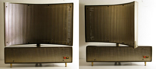
One such design, pictured above, is a free-standing speaker attributed to Phillips. The housing is plastic, the grille perforated metal. If I had to pick a date of production—and I don’t know for sure—I would pick the mid-1950’s. I would not pick the 1940’s, nor would I pick the 1960’s, at least not after 1965. This speaker looks to me like nothing so much as a Morris Lapidus hotel on Collins Avenue. I can almost picture the palm trees lining the circular drive in front, and the biomorphic pool fronting the beach in the back. I don’t know if the tweeter is separated from the woofer, but the top pivots, throwing the swooping curve into sharp relief. I think it looks cooler this way, and I think the hotel it resembles would look cooler this way, too.

In any event, the logo on the front—possibly a PH in a box—is also of the era, and the entire design exudes 1950’s style and swagger. Despite being dated in this way, I would hesitate to call this design kitschy. The best definition of kitsch I’ve encountered, outside of the one in the dictionary, is an object that conveys everything it has to convey at a glance. I’ve had this speaker (actually, a pair of them) for several years, and I am still intrigued by them, and without irony. This has something to do with the way the appearance changes when the top is straight or askew, how different it looks from the front and the back, and how the brass grille catches the light, sometimes shimmering, sometimes stopping the eye at the surface, and sometimes permitting the eye to see through—almost like architecture. Also, I suspect the speaker would sound good if I could plug it in to anything, especially with the top part swiveled to direct the tweeter at the listener’s position.


The JVC video capsule, also made primarily of plastic, is equally dated, albeit to a different decade. As its name suggests, it looks, with the video element closed, like an Apollo space capsule, and if you guessed a production date around 1970, in the wake of the moon landing, you would be correct. The fact that my 12-year-old nephew could have guessed this really locates this object in a precise cultural moment (Actually, my nephew is really smart, and would upbraid me if he read this, saying something like “I must upbraid you, Uncle Larry.”). With the top up, the TV looks something like a robot. Being a Japanese product, I suspect that there is a specific reference to a movie or TV robot of the late 1960‘s. In the end, I’m not sure this design falls on the good side of the kitsch line, but I’ve kept it because I would have loved to have one in 1970.
