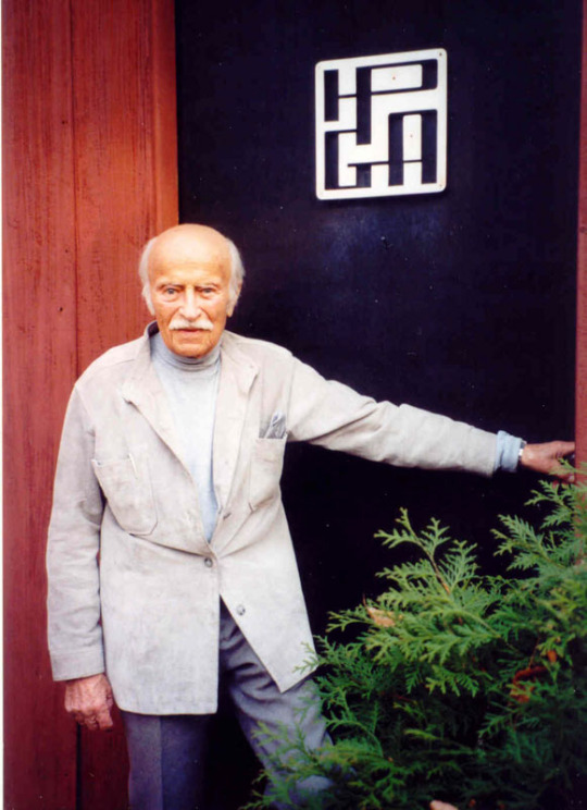
Henry P. Glass

Second Glass: The Industrial Design and Architecture of Henry P. Glass

Originally posted May 7, 2009 on interiordesign.net

I posted last week about Henry Glass’s furniture designs. This week, I’m going to look at his industrial design and architecture, or at least at sketches thereof. In perusing his self-published catalog of 1970—his portfolio, actually—I responded time and again to fanciful and often boldly colored proposals for designs and structures that likely never went into production. More than this, that never stood a chance of going into production, and can best be classified as romantic or utopian. I suspect that Glass felt the same way I did about these projects—he featured them in his portfolio, after all—and I’d guess they provided him with an ongoing source of intellectual and creative nourishment.

For all his interest in mechanisms and modules, and for all his rationalist theory, Henry Glass had a fertile and vivid design imagination, and was given to flights of expressive visual fancy. How do we characterize the visual aspect of his sliding ponds and phone booths, his cars and jungle gyms? By and large, they are biomorphic, fluid, curvilinear, colorful, and visionary. They convey a sense of plasticity and malleability, and hence of possibility. They appear people-friendly and optimistic. The word “imagineering” comes to mind—some Disney-esque combination of imagination and engineering; this was Glass’s work zone, and the Disney reference may not be far-fetched given the range of children’s furniture and playground equipment he designed.

Glass’s architectural thinking is a direct extension of his design thinking (or vice-versa—Glass trained as an architect in Vienna, though he was never licensed here).  Once again, in looking through his catalog, I was drawn to unrealized sketches more so than to built structures. Glass showed an early interest in pre-fabricated, factory-produced housing, an interest directly related to his modular furniture designs. The 1944 sketches for Interiors Magazine are reproduced here. The freeform styling of the rendering in itself suggests a core concern with people—human scale, biomorphic shape, and an organic relationship between people and the environment.

Glass’s 1969 apartment building proposal depicts box-like shapes more conducive to fabrication. That Glass was still planning pre-fabricated housing in the late 1960’s, when few other Americans were, shows a sustained and admirable commitment to working out ideas he deemed important. Note also the model for the collapsible aluminum shelter, an architectural analog to his fold-up, knock-down furniture designs.


Glass produced something on the order of 20,000 drawings during his career. This is a prodigious output that bespeaks a passionate discipline for the process of designing. Some of these drawings have been sold through Architech Gallery in Chicago, which represents the Glass estate. Many of Glass’s design ideas, as well as the forms that expressed them, were simply out of step with commercial realities and prevailing tastes. To his credit, Glass kept drawing. That a number of his abiding concerns—pre-fabrication, modularity, affordability, waste, ecological responsibility—are now topical suggests that Glass’s legacy, as embodied in his drawings, is due for re-evaluation, and for belated recognition of cultural relevance.

From top: Moulded phone booth sketch for Gladwin Plastics, 1966; study in factory produced modular housing for Interiors Magazine, 1944; suburban car proposal for Science and Mechanics, 1951; metal fireplace sketch for Technology/Welded Products, 1967; pre-fab metal slide sketch for Miracle Equipment Co., 1969; sketch for pre-fab modular apartment for Mobile Homes Mfg, 1969; Accordium folding mobile shelter for ALCOA, 1960. All images from the Henry P. Glass Association catalog.
Glass Plus: The Furniture Design of Henry P. Glass

Originally posted April 30, 2009 on interiordesign.net

“In contrast to good music, good literature, good food, or even good art, which are all subject to personal taste, style, fashion, or fad, good design is governed by indisputable, eternal rules, unalterable by conditions of historic environment or location.” -Henry Glass, from “The Shape of Manmade Things” (1994)

While debatable, the above assertion is explicable in terms of Henry Glass’s mindset and life experience. At root, Glass was an industrial designer, not a craftsman or artist, and he brought an engineering sensibility to bear on all aspects of his work, including furniture design. Born in Vienna in 1911, and schooled in architecture at the Technische Hochschule, Glass arrived in America in 1939 via Buchenwald. His experience in a concentration camp likely exaggerated any tendency he had to see his own work in absolute terms, and his rescue likely fueled his desire to spread the benefits of good design to the general public, another part of his lifelong agenda.

An ardent environmentalist, Glass was heavily influenced in his thinking by Buckminster Fuller, a debt explicitly recognized in “The Shape of Manmade Things.” From Fuller, Glass drew lessons in nature, structure, economy, and ecology. In nature, Glass found a model for man-made objects: all things serve a purpose, little is superfluous in terms of ornament or material, and the results are often beautiful. Rigid economy is fundamental in design for serial production; more so when resources are recognized as finite, as they are on Spaceship Earth. As Glass observed, “It is hard to think of an object that was designed with economy in mind, which wouldn’t also respond to ecological considerations, and vice-versa.” Glass built a solar house for himself in 1948, one of the first such structures in the country. Clearly, he was an early proponent of what is now green design.

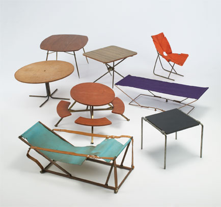
Glass was best known for his knock-down furniture designs, chairs and tables that folded, nested, and stacked. There was a wartime rationale for
such designs involving space-saving flexibility and easy mobility, but he continued developing this paradigm throughout his career. Austere and visually interesting, these designs utilized inexpensive materials such as plywood, masonite, and canvas, and through tensile strength and production technique, reduced waste to a minimum. Here, too, Glass was plainly influenced by Fuller, by the geodesics and tetrahedrons, riffing off the idea of “tensegrity,” inter-connected wires in tension, and non-connected struts in compression.

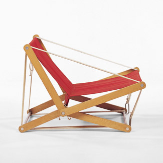
Glass’ most popular design, the Cricket chair of 1978, distills forty years of thought and experiment into a timeless-looking piece that uses an absolute minimum of material—in this case, tubular metal and canvas—and folds down to 1 inch. Represented here by a prototype in wood from Glass’ own collection, the production version was manufactured by Brown Jordan. Not all of Glass’ designs hit their mark commercially, however, and a fair amount of his work exists only in renderings, scale models, prototypes, and catalogs.

I first encountered Glass design in a basement in Mineola in 1993, when I found myself surrounded by a suite of modular and highly colorful children’s furniture. Research proved that I’d uncovered a trove of Swingline collection pieces, designed by Glass and produced by Fleetwood Furniture in the early 1950’s. I think I paid about $150 for six or eight pieces, which I promptly sold for $400-$500 a piece, a tidy profit at the time but far less than the $4,000-$6,000 a piece that these items command now at auction. Still, it whetted my appetite for work by Glass, and when the Form + Function Gallery acquired a group of prototypes from Glass in 2000, I sped over and picked up a few.  Three are shown here.