architecture

People Who Live in Glass Houses

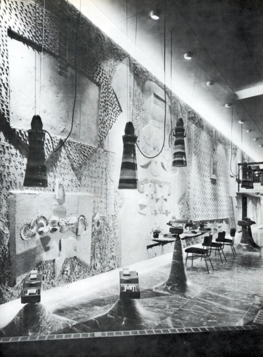
Originally posted May 27, 2010 on interiordesign.net

Thanks to an invitation from interior designer and friend, Brad Ford, who procured tickets for a group of people including Joan and Jayne Michaels, I was able to tour Philip Johnson’s Glass House last week, my first pilgrimage to a modernist icon outside of New York. 

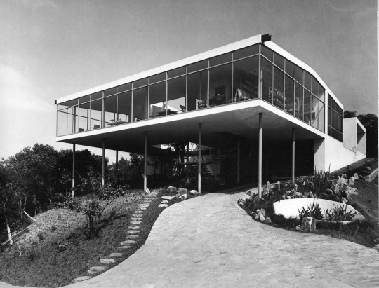
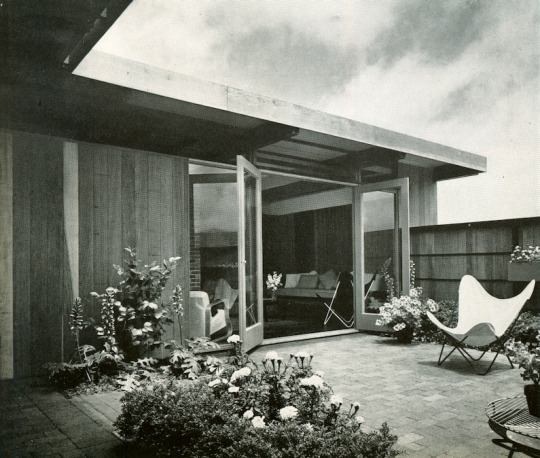
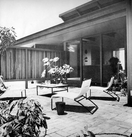
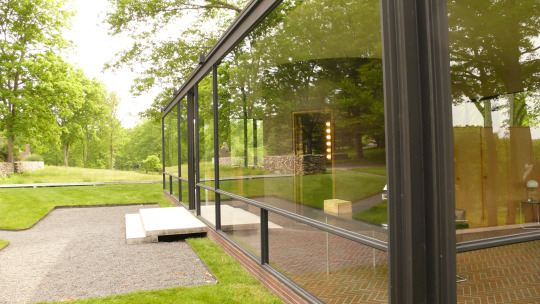
The White Gods (Tom Wolfe’s term for Gropius, Breuer, Mies, et al) were smiling on us—the day was warm and overcast, with enough sunlight for reflections and shadows. I entered the 47-acre property in New Caanan with an open mind, ready to be enchanted by the combination of natural and man-made beauty, and in this I was not disappointed. The story is that Johnson purchased the initial parcel five minutes after he saw it, because of the promontory overlooking the woods and the pond. Built atop this promontory in 1949, the Glass House took the idea of a glass box, where the view became the walls, to an extreme: farther than the Eames house, which had about half glass and half multicolor panels in its cladding, and as far as Mies’ Farnsworth House, built in 1951 but designed in 1945.

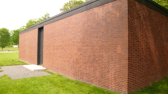
Walking around the Glass House, and the Brick House opposite it, the dynamic and avante garde elements are apparent: with its charcoal-painted steel I-beams and glass walls, the house disappears into the landscape as much as a house can. The relationship between inside and outside is fluid, influenced by lighting conditions and where you are standing. From outside especially, ever-changing reflections of trees make the view layered and complex. In some respects, this was something new and daring, and to the Beaux-Arts establishment, vaguely threatening.

Yet, the overweening impression at the estate is of classicism, or neo-classicism, and the direct representation or allusion to classical architecture. This is not a new observation, and Johnson’s Wikipedia entry points to his classical scholarship at Harvard, and to his two grand tours of Europe. Surely, the stripped-down modernism of the Glass House and Brick House is more Doric than Corinthian, with the vertical steel I-beams and the row of tall trees behind the house referencing colonnades. Also, the triangular paths between the house and the guest house govern the sight lines along 45-degree angles, a Greek practice. In more overt ways, the underground structure housing the painting collection has a façade based on Agamemnon’s tomb on Mycenae, and the building housing the sculpture collection is a postmodern archaeological essay.

What all this means, I don’t know, and when Johnson was alive, it didn’t matter much, as it was after all a private residence. On one level, the Johnson estate makes a statement about the intimate connection between classicism and avant-garde modernism, a connection refuted for a time at least by most practicing modernists.

In Johnson’s life, the abiding relevance of history is tantamount, and this makes it harder to forget Johnson’s more than brief flirtation with Nazism prior to WWII. Given Johnson’s youthful fascistic tendencies, and given his bequest of the estate to the National Trust, what were private issues have become public matters. Did Johnson see himself as a citizen of the world or as emperor of his own domain? Was he referencing Greece of the Agora or Rome of Caesar’s Palace? Was he aware that Agamemnon has been portrayed as stubborn and arrogant? That he left the estate to the common weal is a good sign; what exactly the estate signifies speaks to whether the bequest was an act of altruism or an inside joke.

Roosevelt Island: A Tradition of Brutalism

Originallly posted December 9, 2010 on interiordesign.net

Roosevelt Island, formerly Welfare Island, has a rich and unusual architectural history. As an island next to a metropolis, it was used during the nineteenth century to sequester the insane and the infirm. (For a treatment of the cultural basis of such insanity, see Michel Foucault’s seminal “Madness and Civilization”). The dominant structures were Andrew Jackson Davis’ 1839 NYC Lunatic Asylum, which included the still-standing Octagon, and James Renwick’s 1856 Smallpox Hospital. Also included was a workhouse built in 1852 that continued to house petty criminals until the completion of the jail at Riker’s Island.

The shift from institutional to residential brutalism began in 1969, with the leasing of the island to NY State’s Urban Development Corp. (UDC). From the beginning of the lease, the island became a planned community, expressing modernist architectural concerns with housing and planning, as well as appearance. Philip Johnson and John Burgee contributed the plan, which created housing for 20,000 mid-income residents, such as teachers, under the aegis of Mitchell-LAMA.

A walk around the grounds of the Riverview and Eastwood apartments puts one in mind of Corbusier in Marseilles, or Oscar Niemeyer in Brazil. The direct connection here is Jose Luis Sert, who designed the Eastwood, completed in 1975. The Spanish-born Sert, dean of the Harvard Graduate School of Design at the time, was a protégé of Corbusier, and worked on urban planning projects in Latin America before landing at Harvard. The lead architect of the Riverview, John Johansen, was himself a 1939 graduate of the Harvard program, and a member of the Harvard Five, along with Philip Johnson.
If not intellectually surprising, then, the striking modernist vistas at Roosevelt Island are nonetheless unexpected. The buildings themselves reflect the austere geometry of the International Style–boxes and rectangles–but tempered for human needs, including the need for visual diversity. The step-backs and ample fenestration provide panoramic views of the river and the City; a walkway with benches loops the island; both the Eastwood and Riverview have indoor pools.

As for the appearance, it is textbook Brutalism: texture, pattern, and color temper the structural geometry. Beton brut–raw concrete–is the dominant material, followed by brick, slate, colored ceramic tile, and painted metal. Elements such as the painted tubular ducts, reminiscent of a ship, add nautical local flavor. The colors–orange, yellow, blue–recall Corbusier, as does the use of pilots.

A close look at exterior detailing reveals a tapestry of pattern, material, shape, and color, such as at the entrance to the Rivercross. Even a view up the façade shows a juxtaposition of line and shape, horizontals and verticals that change with the light and weather. The interiors of both buildings feature orange and yellow tiles, and spare but warm furnishings mixing wood and metal with leather and fabric. Highly textured concrete walls in the recently restored Rivercross become visual features. Unfortunately, I was not encouraged to photograph the interior at Rivercross, or I’d be sharing those images here. I’m not sure what type of reception you can expect, but it is worth a trip on the tram to look at these two buildings, and to experience the quirky and somewhat quixotic architectural moment of 1970’s Brutalism.

The Modernism of Lina Bo Bardi

Originally posted June 10, 2010 on interiordesign.net

“The most important thing [in architecture] is not to construct well but to know how the majority of the folk live.” -Lina Bo Bardi, 1975

Lina Bo Bardi (1914-92), the Italian/Brazilian polymath, remains an under-appreciated modernist architect, designer, and thinker. The reasons for this surely include gender-as a woman, she was overshadowed by Niemeyer and Costa, and by Rodriguez and Tenreiro. Also, a lavishly illustrated treatise published in 1993 by the Instituto Lina Bo e P.M. Bardi is written in Portuguese (thanks to my half-Brazilian summer intern, Anna Levenshus, for her translations), and a perceptive article from 2002 is in the Harvard Design Magazine, neither of which sit on many American coffee tables. Of her architectural projects, The Glass House (1951) and the Sao Paolo Art Museum (1957-68) are perhaps known, as is the Bowl Chair (1951) among her designs. The rest is ripe for rediscovery and reevaluation.

It is tempting to see Bo Bardi as a sort of hybrid flower, transplanted from Italy to Brazil, where she blossomed in the unfettered and lush environment, trading an early Corbusier for a mature Frank Lloyd Wright as an avatar, shucking the encroaching formalism of the International Style for a direct and unencumbered engagement of local needs (both material and psychological), customs, topography, and materials. In short, as a proponent of the sort of dynamic and organic modern architecture advocated by Bruno Zevi, with whom she edited a journal in the mid 1940’s. Zevi, an Italian Lewis Mumford, opposed classicism, reductionism, or a priori thinking and embraced, a la FLW, an architecture style oriented toward space and the life taking place within that space. To Bo Bardi, the rain forest/wilderness held a promise of creative liberation: “Brazil is an unimaginable country, where everything is possible.” Bo Bardi’s thoughts about the Brazilian zeitgeist, quoted above, points in this direction.

The problem with this notion is that Bo Bardi was pretty much full-grown before she left for Brazil. She possessed a degree in architecture, was well-versed in Italian rationalism, influenced by early Corbusier, and by the design agenda of Gio Ponti, for whom she worked and edited. Tossing Zevi into the mix makes for a complex mix. On some level, Bo Bardi absorbed and internalized any number of conflicts within avant-garde modernism. Her career in Brazil probably represents a working through of these conflicts rather than any resolution of them-abandoning a priori thinking is easier said than done.

Five of the six images shown here illustrate this. The Glass House, built as her own residence in 1951, is obviously less William Wurster than Mies or Philip Johnson. The early photo of the house, sans flora, shows a sort of Farnsworth House on pilotes–a glass box plunked down on the edge of a rain forest. That Bo Bardi replanted and intended the rain forest to grow back around the house makes little difference-the photo has its own visual and historical reality. The second image, with the house hidden amidst the flora, casting ever-changing reflections, is closer to the Johnson Glass House of 1949, and more in the direction of the dynamic/explosive/regional, providing that the rainforest was allowed to grow back naturally and chaotically (as opposed to the planted, pruned, mowed, and over-determined landscape at the Johnson House). The overall impression is of an International Style goldfish bowl, a holding tank for acclimating to a new environment.

Similarly, the two furniture designs shown here, while very much of their moment synchronically, are less specific in terms of place. Either one could have been designed and produced in Italy-the chaise of 1948 is reminiscent of Ponti in its shape, the planes of the arms, and two-tone graphic character of the upholstery, while the Bowl chair of 1951-a rationalist hemisphere atop a circle and four lines-could have been done by Roberto Mango. Unless the bowl represents a coconut shell, there is little connection to Brazil. More connection is seen in the Casa Cyrell of 1958, with its thatched roof, local ceramic shard-laced cement walls outside, Santos inside, and profuse vegetation everywhere.

All this only suggests that Bo Bardi, like Corbusier, like Frank Lloyd Wright, was a complicated figure. Any reassessment of her career needs to apprehend this. Her story, as it continues to emerge, will shed light on a number of Big Themes in the history of design and architecture-gender, politics, philosophy, aesthetics, housing and so on.

The Brief but Notable Career of Gordon Drake

Originally posted October 22, 2009 on interiordesign.net

image

When Gordon Drake died while skiing at age 35 in 1952, he accidentally ended an architectural career that was as meteoric as it was brief.  In seven years, he completed a scant dozen or so buildings, but his first two won national recognition in architectural competitions, and his reputation was such that his buildings, sketches, and writings influenced the postwar built environment, and inspired a book, “The California Houses of Gordon Drake,” published in 1956.

image

Born in Texas, Drake served in the Marines during WWII and moved to the West Coast when discharged.  More than anything else, Drake was a California designer, working out his ideas with respect to local climate, topography, lifestyle, and mindset.  As he noted at the beginning of his career, “the dominant factor in the development of California’s domestic architecture has been the…lack of a stifling formal tradition. The resulting freedom of thought has given the architect an untrammeled concept that does not exist in other parts of the country.”  Drake’s contribution to this concept was a vision of the small house, artfully sited in nature, well suited to indoor-outdoor living, and affordable.

image

Like many mid-century designers, Drake’s first project was done for himself, and at low cost.  Completed in 1946, the Drake house in Los Angeles won first Prize from Progressive Architecture in a competition aimed at raising contemporary standards for residential living.  An editor noted, “Seldom does one see work in which structure, site, and clients’ needs merge so completely in the process of design.” Recognition was also given to Drake’s next project, the Spillman House (also in LA), which won second prize in House and Garden’s 1947 Award in Architecture.

image

Drake’s first houses served as a template for his subsequent work in terms of the liberal use of timber and plywood, in the centrality of light as a design element, in the integration of natural beauty with structure, and in the simple, modular construction methods. Wood was prevalent in California, and inexpensive.  Drake favored rough-hewn boards on the outside for form and texture, set off against the “magnificent sophistication of waxed plywood on the interior.”  Natural light was brought into the house through clerestories, glass gable ends, translucent screens, and glass walls.  Both natural and artificial light were modulated to create moods and meet use requirements.

image

All of Drake’s efforts were intended to bring a decent quality of living to the general public, to make good design in architecture affordable.  As Walter Doty noted of Drake, “He felt that architecture was without meaning until it was used.  The publication of a prize-wining house meant very little unless it brought about the designing of thousands of houses…”  Drake himself sought an attitude of humility in himself and his building, stating “Buildings are judged by whether or not the people who live in them are happy or unhappy.”

image

Looking at Drake’s work, one is struck by its restrained elegance, by its almost Asian sparseness and simplicity, by the beauty of its site, and by the seamless integration of indoor and outdoor spaces.  Indeed, his work is its most impressive and exceptional at the liminal—the boundary—between indoor and outdoor, the precise point at which California architects embraced their zeitgeist.  Most of the photos in the book stress this—doors or screens are shown open, so that outside space flows in, and vice versa.  And strictly interior shots are pedestrian compared to the beauty and originality of shots involving outdoor areas—shots of houses set in their surroundings, of adjacent terraces, patios, and gardens, of outdoor areas looking inside, or inside spaces looking out. 

image

Drake’s work illustrates the new way of living developing in California after WWII. His career helped demonstrate the feasibility and even practicality of low-cost, high-quality design in domestic architecture, and expanded the sense of visual possibility in regard to indoor-outdoor living.

Leslie Larson: Lighting the Way

Originally posted August 19, 2019 on interiordesign.net

Leslie Larson, a Boston-based lighting designer and wood sculptor, began his 1964 disquisition “Lighting and its Design” with the observations that there were few well-designed lighting fixtures commercially available in America, and that architects too often neglected lighting design as an integral aspect of building. Larson himself designed both lighting systems and fixtures, and in his book, he makes a case for the importance of good lighting, and not incidentally, a good lighting consultant.

On a fundamental level, Larson points out that without light, form and space are not visible, and that the influence of light on the culture and psychology of man is too great for it to be treated mechanically. In short, lighting needs to be considered as a design problem, not an engineering one, and needs to be treated with specificity and with an awareness of both physiological and psychological needs. Beyond enabling the eye to function freely, a good lighting solution enlivens a space and addresses needs for excitement and repose, variety and even drama. Shadow and darkness, as well as natural and artificial light sources, are key elements for Larson–that the illustrations are all in black and white emphasizes this.

Larson provides numerous examples of buildings with well-handled lighting. These range from churches and cathedrals to auditoriums and offices–from the sacred to the profane. Ronchamp and the Guggenheim are singled out, neither surprisingly. Six projects caught my attention as good illustrations of Larson’s argument, and beautifully lit spaces:

1. The Vasterport Church in Vallingby, Sweden, architect Carl Nyren. Natural light coming from on high creates a spiritual aura, while the wall brackets add to the drama.

2. Dome over the Palazzo dello Sport in Rome, architect Paolo Nervi. Light and shadow define Nervi’s masterwork. By day, the brilliantly lit center recess is the focal point set against the softly lit radiating ribs. At night, the dark-lit pattern is reversed.

3. Interior of the Chase Manhattan Bank in Great Neck, New York, The Architects Collaborative. A humble space that is nonetheless crisply delineated by light and shade.

4. The Olivetti showroom, NYC, BBPR architects. The contours and textures of the sand relief mural by Constantino Nivola pick up light and cast shadows; the whole is vividly outlined by cushions of light. Note also the Venini hanging fixtures, which really beg to be seen in color.

5. The St. Louis Air Terminal: Hellmuth, Yamasaki, and Leinweber, architects. Skylights at the junction points of the interlocking vaults provide natural light, while artificial lighting is placed above eye level. Light is projected upward at the surface of the vaulting, which becomes luminous in gradations.

6. Kresge Chapel, MIT: Eero Saarinen, architect, with Stanley McCandless, lighting consultant. An American Ronchamp, perhaps. Poetically lit with direct light from above, which filters downward via Harry Bertoia’s shimmering metal screen.