Originally posted October 23, 2008 on interiordesign.net
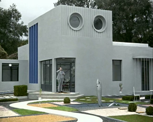
I watched Jacques Tati’s “Mon Oncle” (1958) the other night. Focusing on the furniture, I came to realize a few things about the film: Yes, it is a satiric send-up of modern technology and culture, a parable that opposes a modern world at once sleek, antiseptically clean, automated, superficial, and inhospitable with a traditional milieu that is spontaneous and convivial, if messy. And yes, Tati is a latter day Chaplin (or present-day Lucille Ball?), a French everyman whose bumblings expose the sterility, fatuousness, and pretension of modern machine civilization. But people who live in glass houses shouldn’t throw stones, and at least part of Tati occupies the modernist and strikingly beautiful Villa Arpel.
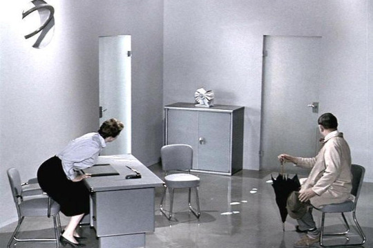
Tati was born in 1907 and came of age during the 1920’s, the heyday of avant-garde modernism, the era in France of Mallet-Stevens and a young Le Corbusier. If you plainly see in “Mon Oncle” Tati’s nostalgia for a traditional, older world (which, incidentally, was not about to disappear soon in 1950’s France), you also see the formative artistic pull of modernism. The Villa Arpel reflects a sensibility weened on Le Corbusier—it is an iteration of the “machine for living in,” with its technical gadgets, its decorative asperity, and its conspicuous lack of comfort.
But even in the 1920’s, the machine for living in was more a polemical construct than an actuality. By 1956, no one near the mainstream was seriously advocating living in a machine, nor was minimalism apropos to a decade of rampant consumerism. The Villa Arpel was hence an easy target for satire—a clay pigeon, really—and an idiosyncratic vehicle for a parable.
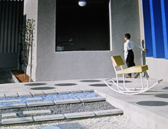
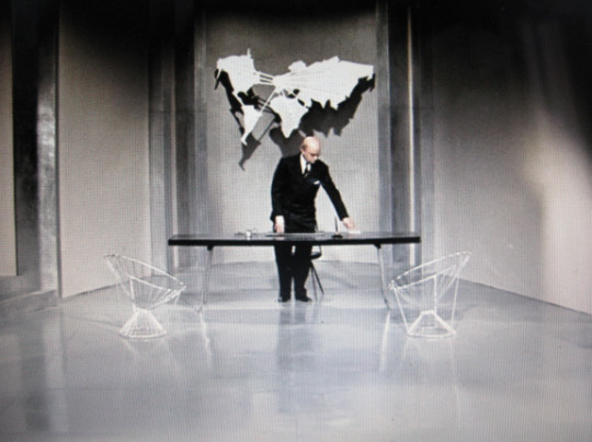
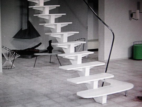
It was also an expression of Tati’s own artistic temperament. Tati was a mime with a mime’s economy of motion, gesture, and obviously, words. Minimalism is integral to this art form, and naturally extends to set design. It is not surprising, then, that the Villa Arpel is minimalist (“this is the vase”). What is surprising is how far beyond caricature Tati ventures. The Villa Arpel sets are brilliantly edited and meticulously executed, from the selection of furnishings, which include works by designers such as Baltensweiler, Chambost, Mategot, and Motte, to the spare and elegant arrangements of the pieces, to the vivid accents of color visible in the furniture and clothing, to the outdoor landscaping. The vistas are visually exciting and photographically beautiful. Tati needed only to construct a target for his arrows; instead, he created a tour-de-force of mid-century modernism that looks as fresh today as it did fifty years ago, and still resonates as an abstract work of art. In its day, the Villa Arpel was copied by a fan as a residence; more recently, it has been the subject of museum exhibitions tracking Tati’s influence on modern design. In the end, the Villa Arpel was rendered with such aplomb and virtuosity, it was so clearly inspired, that it documents the undeniable joy, delight, and creative exuberance unleashed by avant-garde modernism, and this complicates the message of the film, or perhaps makes it a greater work of art.
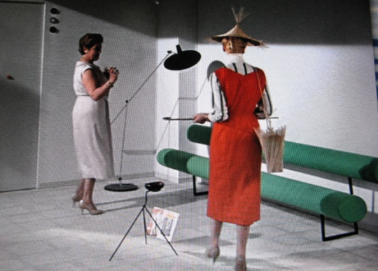
Nowhere is Tati’s ambivalence toward modernism more apparent than with the furniture he designed (along with Jacques Lagrange, his longtime set designer) for the Villa Arpel. The three key pieces—the “Haricot” sofa (shaped like a bean), the rocking chair with the yellow seat, and the “Harper” sofa (think two tootsie rolls connected by a folded paper clip)—are designed to convey discomfort. At this they succeed, but again Tati goes further than needed. The rocking chair has a long seat and short back, forcing M. Arpel to slouch when seated, but this element creates an asymmetry that is visually exciting. The Haricot sofa looks impossible to lounge upon, and Hulot is forced to turn it on its side to sleep on it. Try this, though, and you will understand how much effort went into the design, which referenced both Perriand and Kiesler (the 1942 Peggy Guggenheim installation).The Harper sofa is shown with a woman perched rigidly on it, but it is the most beautiful of Tati’s designs—and one of the most striking sofas of the fifties—bridging the precision of the machine age and the sculptural presence of the mid-century (Lescaze meets Noguchi). One could even argue that these pieces rate highly as good design; they are visually excellent and suited to purpose, given that their purpose is to look uncomfortable. As a testament to their enduring appeal, all three designs were recently issued by Domeau & Peres in an edition of eight. Ironically, Tati anticipated not only the minimalism of the 1960’s but the limited-edition, not-for-comfort design/art of the present decade.
