Circular Reasoning: On the Geometry of Chairs

Originally posted November 24, 2010 on interiordesign.net

Beginning with de Stijl, geometry became an obvious metaphor for the scientific and mechanistic modes of thinking associated with avant-garde modernism. Mondrian’s canvases, arguably influenced themselves by Frank Lloyd Wright’s Prairie School architecture, became templates for mid-century wall systems and modular case good systems, as well as graphic inspiration for architecture.

All of these applications self-evidently involved rectilinearity or at least linearity–the so-called deconstruction and reconstruction of the box, applied both to surface and volume. Famously, this was the approach taken with Rietveld’s Red and Blue chair, which was explicitly linear, a rigid composition of wooden planks designed with little regard for comfort. Much cantilevered, Bauhaus-inspired furniture would also fit into this camp, though with somewhat greater interest in comfort. In the opposing, organic camp, are chairs such as the Womb chair, ergonomic in character, curvilinear, and fitted to the human form.


The circle occupies a place somewhere in between though much closer to the geometric camp; in Platonic terms, the circle is perfect, the ultimate geometric symbol of wholeness, unity, infinity. With tables, there is a long tradition of circular design: the Knights of the Round Table, round table discussions, etc. (note the underlying egalitarian aspect of this shape–no one sits in a privileged position).

Though curvilinear, the circle does not suggest itself for chair design–people have curves but are not hemispheric or conical, at least generally speaking. A circular or spherical chair is not inherently ergonomic, though it can be rendered comfortable with slings, padding, pillows, or butt-shaped indentations. Partly for this reason, and likely for technical reasons also, relatively few chair designs hewed to the geometry of the circle. And those that did tended to have an agenda: either experiments in form or ideological or symbolic statements of some type.

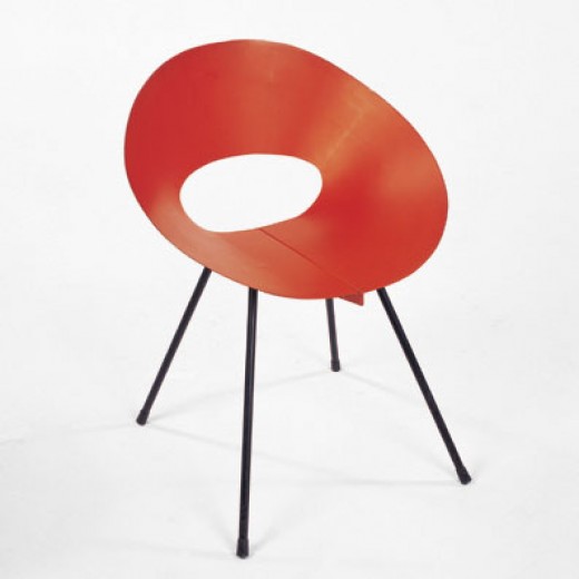
Beginning in the early 1950’s, the circle was deployed in chair design in the work of Donald Knorr, Lina Bo Bardi, and Roberto Mango. Knorr’s chair, shaped from a ribbon of sheet metal, shared first prize in a 1950 MoMA Low-Cost Furniture competition. Distributed by Knoll, and painted red, yellow, or black, with black metal legs, the chair possessed a minimalist and elegant beauty. Intended to be comfortable, the chair was also offered in a padded version, just in case. Bo Bardi, the Italian/Brazilian architect and designer, contributed an eye-catching chair consisting of a hemispheric seat floating inside a round tubular metal base. The chair could be used parallel to the ground or at an angle, for a variety of seating or lounging positions. The image here, which uncropped shows two such options, is from the cover of an Interiors magazine from the early 1950’s. It is notable, and surely meaningful, that Bo Bardi is a woman designer and the circle is a female archetype. Unlike Knorr and Bo Bardi, the Mango chair illustrated here is made of wood–in this case shaped plywood–and it looks like a James Prestini bowl on legs. This chair is part of a series done by Mango in wood and metal, exploring the possibilities of the circle as a chair frame. Significantly, all the designs referred to here had one thing in common: a lack of commercial success, and hence a small production run.

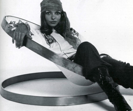
Continuing this tradition were three circular chair designs from the late 1960’s. In the case of Arman’s 1969 chair for Atelier A, consisting of two steel rings with a leather sling, the intent was not serial production but design/art; more a functional sculpture than a seating solution. Joe Colombo’s 1969 Tube chair for Flexform cleverly used round tubes looking like paint rollers to achieve a variety of seating options. Despite advertisements pointing to the comfort obtainable through the flexibility of assembly, the chair was far too radical for prevalent taste cultures.

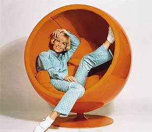
Somewhat more accessible, and commercially viable, was the work in plastic by Finnish designer Eero Aarnio. His Pastille chair of 1967, with its contoured seating indentation, took the circle in an ergonomic direction, while his Ball chair of 1969, shown here and based on a sphere, required cushions and pillows to suggest comfort. The Ball chair stood, and stands, as a production analog to the utopian 1960’s preoccupation with self-contained living environments.

While this is not an exhaustive list of post-war circular chair designs, the two clusters around 1950 and 1969 do suggest an underlying cultural rationale at those moments—some metaphoric or symbolic reason for this attraction to the circle.  A topic I will deal with when I get around to it…

Roosevelt Island: A Tradition of Brutalism

Originallly posted December 9, 2010 on interiordesign.net

Roosevelt Island, formerly Welfare Island, has a rich and unusual architectural history. As an island next to a metropolis, it was used during the nineteenth century to sequester the insane and the infirm. (For a treatment of the cultural basis of such insanity, see Michel Foucault’s seminal “Madness and Civilization”). The dominant structures were Andrew Jackson Davis’ 1839 NYC Lunatic Asylum, which included the still-standing Octagon, and James Renwick’s 1856 Smallpox Hospital. Also included was a workhouse built in 1852 that continued to house petty criminals until the completion of the jail at Riker’s Island.

The shift from institutional to residential brutalism began in 1969, with the leasing of the island to NY State’s Urban Development Corp. (UDC). From the beginning of the lease, the island became a planned community, expressing modernist architectural concerns with housing and planning, as well as appearance. Philip Johnson and John Burgee contributed the plan, which created housing for 20,000 mid-income residents, such as teachers, under the aegis of Mitchell-LAMA.

A walk around the grounds of the Riverview and Eastwood apartments puts one in mind of Corbusier in Marseilles, or Oscar Niemeyer in Brazil. The direct connection here is Jose Luis Sert, who designed the Eastwood, completed in 1975. The Spanish-born Sert, dean of the Harvard Graduate School of Design at the time, was a protégé of Corbusier, and worked on urban planning projects in Latin America before landing at Harvard. The lead architect of the Riverview, John Johansen, was himself a 1939 graduate of the Harvard program, and a member of the Harvard Five, along with Philip Johnson.
If not intellectually surprising, then, the striking modernist vistas at Roosevelt Island are nonetheless unexpected. The buildings themselves reflect the austere geometry of the International Style–boxes and rectangles–but tempered for human needs, including the need for visual diversity. The step-backs and ample fenestration provide panoramic views of the river and the City; a walkway with benches loops the island; both the Eastwood and Riverview have indoor pools.

As for the appearance, it is textbook Brutalism: texture, pattern, and color temper the structural geometry. Beton brut–raw concrete–is the dominant material, followed by brick, slate, colored ceramic tile, and painted metal. Elements such as the painted tubular ducts, reminiscent of a ship, add nautical local flavor. The colors–orange, yellow, blue–recall Corbusier, as does the use of pilots.

A close look at exterior detailing reveals a tapestry of pattern, material, shape, and color, such as at the entrance to the Rivercross. Even a view up the façade shows a juxtaposition of line and shape, horizontals and verticals that change with the light and weather. The interiors of both buildings feature orange and yellow tiles, and spare but warm furnishings mixing wood and metal with leather and fabric. Highly textured concrete walls in the recently restored Rivercross become visual features. Unfortunately, I was not encouraged to photograph the interior at Rivercross, or I’d be sharing those images here. I’m not sure what type of reception you can expect, but it is worth a trip on the tram to look at these two buildings, and to experience the quirky and somewhat quixotic architectural moment of 1970’s Brutalism.

Norwegian Wood, and Other Substances

Originally posted January 21, 2011 on interiordesign.net

Scandinavian Design, as understood in the modern design marketplace and the secondary literature, is a major constituent of Western modernism in terms of style, influence, and popularity.  Even through the recession, demand for vintage, high end craft production from Denmark, Sweden, and Finland remained strong.  Left out of the mix, or at least neglected, has been design and decorative art from Norway.

I’m not sure why this is so–I think Norway’s population is smaller than her neighbors–but it is not from lack of a suitable attitude or effort in Norway.  Listen to this introduction, from the booklet “Norwegian Arts and Crafts [and] Industrial Design,” published around 1960, which gives us a window into this subject:  

“Although it would be wrong to say that applied arts and industrial design have been developed farther in Norway than in other countries…it would certainly be no exaggeration to say that the average Norwegian believes that his life can be enriched by beautiful and yet practical surroundings, and is therefore very conscious of the importance of design…Thanks to the inherited feeling for form and color and to the first-class training provided by its technical schools, Norway is able to retain its position among the leading countries in the sphere of applied art, both in industrial design and in arts and crafts.”

Granted, this is from a source intended to promote Norwegian design to English speaking countries.  It still points to ongoing traditions of craftsmanship and design consciousness that provided continuity and impetus to the modernisms in other Scandinavian countries.  “Norwegian Arts and Crafts” is filled with examples of contemporary work in furniture, lighting, dinnerware, pottery, glass, metal, textiles, jewelry, and wood. Much of it is appealing, if not iconic, and it presents a representative cross-section of design activity in Norway. Yet there is nary a household name mentioned.

Five images from the catalog are presented here:  the cover, in color, features a sling chair by Frederik Kayser; the wooden toy figures are by Arne Tjomsland; the glass vase and bowls are by Arne Jon Jutrem for Hadeland; the ceramic teapot and vase are by Nils Jorgensen; the hanging lamps are by Arnulf Bjorshol; the flatware by Arne Korsmo.  Also shown is a ceramic vase by Norway’s best-esteemed potter, Eric Ploen, taken from the Freeforms gallery website. You get the point:  nice work, by artisans and designers you’ve never heard about.

If you look for Norwegian design year to year in “The Studio Yearbook,” you will find it, alongside work from the other Scandinavian countries.  Perhaps not as much material as Denmark, Sweden, and Finland, but maybe in a ratio of 1:3 to 1:4.  If you look on 1stdibs now, you will find 1 page of Norwegian design—including a pair of the Frederik Kayser armchairs—compared to 21 pages of Danish design and 12 pages of Swedish design.

So the question is:  whither Norwegian design? Why is it so under-represented in the marketplace? Is it a matter of adjudged quality, or a lack of exposure to the material?

Design Education: Pratt, 1952

Originally posted October 8, 2010 on interiordesign.net

If all of the objects from the early 1950’s shown here look unfamiliar, that is because none of them was ever produced or distributed. All are student projects from the Experimental Design Laboratory at Pratt, taken from an article by Alexander Kostellow, chairman of Pratt’s Industrial Design Department, published in Interiors magazine in June, 1952. Founded by Donald Dohner in 1936, Pratt’s Industrial Design Department took a broadly humanistic approach to training future designers, one that sought to develop creative potential, but one that ultimately centered around machine techniques, hands-on experience, and constant experimentation.

The Experimental Design Laboratory, headed in the 1950’s by Luigi Contini, an engineer, and Victor Canzani, collaborated with companies such as Monsanto Chemicals (Plastics Division), Reynolds Metal, Shell Oil, Elgin Watch, Gorham Silver, and E.A. Electrical Co, so that by the fourth (and final) year of study, students were working on actual, real-world problems.

Some of the solutions proposed by these students are shown here. Of the furniture shown in the group photo, I like the profile of the chair on the middle right, and the low rectangular coffee table in the middle left. The chair with the woven seat in the middle also looks interesting. I’ve looked many times at the self-contained kitchen unit made of wood, metal, and plastic. Raised off the floor to prevent dirt collection, it included electric hot plates, work and storage space, and a sculptural hood that floats over the top, suspended by a guide wire. Overall, a sort of Milo Baughman meets the Jetsons fantasy that could be plugged into a high-end interior today.

Also intriguing to me is the cylindrical voltmeter with its electronics exposed inside a plastic tube. I could see this object re-cast as a radio I’d want to own. “More charming than functionally serious” is how the Japanese-looking scale is described in the article, but on a visual scale of 1-10, it is at least a 9. Thrown in too, are the second-year experiments in designing with metal strips, which also shows the students’ interest in photography. A look at a larger sampling of student work from the 50’s and 60’s would make a great blog, article, or exhibit. Any lenders out there?

‘The Jetsons’ on the Drawing Board

Originally posted September 30, 2010 on interiordesign.net

From time to time I look online for still images of “The Jetsons” interiors for a post about cool futuristic design in animated TV sitcoms. Sooner or later, I’ll rent the DVD of the first season and photograph selected frames. Yesterday, though, I came across a website devoted to the animation art of Irv Spector, put up in 2008 by his son, Jay.

Irv worked for Paramount and Hana-Barbera, and one of his assignments was to do background and character studies for the first season of “The Jetsons.” For anyone growing up in the 1960’s, the show was a must-see, a futuristic version of “The Flintstones,” which was itself an animated variation of “The Honeymooners.”

Premiering in September 1962 on Sunday nights on ABC, “The Jetsons” had an initial run of 24 episodes, ending in March 1963 (it would be resurrected for another 50 episodes in the 80’s). Thanks to serialization, “The Jetsons” had a cultural impact beyond its short run-“that’s so Jetsons” is still a pejorative way to describe postwar design. Yet, as the renderings shown here demonstrate, the creative vision behind the program had much on the ball in terms of architectural and design savvy.

Among Irv Spector’s papers was a drawing of Saarinen’s TWA terminal-to Jay Spector a clear indication of the primary source of inspiration. The other source mentioned on discussion boards is the Seattle Space Needle. Both structures are clearly visible in the parabolas, swooping arcs, soaring arches, and freeform shapes of Irv’s drawings-the police station is a miniature TWA terminal; the tower on the right, a version of the Space Needle. I especially like the first three renderings, sans George and Jane-these look like architectural or interior design proposals from a leading early 60’s firm, more Oscar Niemeyer, even, than Morris Lapidus (sorry, Morris).

Surely, the vision of the future presented in the Jetsons owes much to 50’s architectural and design practice-this, after all, was the “googie” decade, the era of Las Vegas and Miami. But it is worth noting that both the TWA Terminal and the Seattle Space Needle opened in 1962, just as “The Jetsons” came on the air. This sort of aesthetic synchronicity is rare in movies or TV; just look at “Men in Black,” where the futuristic furniture was designed in the 50’s and 60’s. Even Morgue’s Djinn series came out three years before “2001” aired. So people watching “The Jetsons” in 1962-and given the Sunday-night time slot, this likely included as many adults as children-were absorbing utterly contemporary interior design and architectural references that conveyed futurism in their moment (“The Jetsons” was set in 2062) and still continue to do so.

As for the gadgets and gizmos, that is another story, but have a look at the flat-screen TV/video phone shown here. Thanks, Jay, for sharing your father’s work.